London, 1898–9
Blue London, Red London: Charles Booth’s poverty map, one colour at a time
In 1898 and 1899 investigators working for the businessman Charles Booth walked London beside police officers, and their notes were used to recolour his map of its streets by the condition of their people: black and blue for the poorest, red for the well-to-do, yellow for the wealthy. Choose a colour, or look up a street you know.

Hold Ctrl or ⌘ and scroll to zoom
Map: LSE Library, public domain
Showing in colour: dark blue (very poor); light blue (poor)
Blue London
Two of the seven colours are blue.
Dark blue: Very poor, casual. Chronic want.
Light blue: Poor. 18s. to 21s. a week for a moderate family.
7.1% of the colour printed on the map. The largest shares are in today’s boroughs of Tower Hamlets (26%), Southwark (19%) and Islington (9.4%).
Black London
Black: Lowest class. Vicious, semi-criminal.
0.35% of the colour printed on the map. The largest shares are in today’s boroughs of Tower Hamlets (43%), Kensington and Chelsea (9.9%) and Southwark (9.7%).
Dark-blue London
Dark blue: Very poor, casual. Chronic want.
2.0% of the colour printed on the map. The largest shares are in today’s boroughs of Tower Hamlets (28%), Southwark (21%) and Hackney (12%).
Light-blue London
Light blue: Poor. 18s. to 21s. a week for a moderate family.
5.1% of the colour printed on the map. The largest shares are in today’s boroughs of Tower Hamlets (25%), Southwark (18%) and Islington (8.9%).
Purple London
Purple: Mixed. Some comfortable, others poor.
20% of the colour printed on the map. The largest shares are in today’s boroughs of Tower Hamlets (22%), Southwark (17%) and Islington (9.9%).
Pink London
Pink: Fairly comfortable. Good ordinary earnings.
39% of the colour printed on the map. The largest shares are in today’s boroughs of Southwark (16%), Westminster (10%) and Lambeth (9.9%).
Red London
Red: Middle class. Well-to-do.
26% of the colour printed on the map. The largest shares are in today’s boroughs of Westminster (16%), Camden (15%) and Lambeth (10%).
Yellow London
Yellow: Upper-middle and Upper classes. Wealthy.
7.5% of the colour printed on the map. The largest shares are in today’s boroughs of Westminster (43%), Kensington and Chelsea (26%) and Camden (12%).
Seven-colour London
The map as printed: twelve sheets joined, with 45 square kilometres of colour laid over a street map at six inches to the mile. The City of London, parks, docks and railways carry no colour.
What did the colours on Booth’s poverty map mean?
The key is printed under every sheet. It begins: “The streets are coloured according to the general condition of the inhabitants”. Seven colours follow, and the words beside them here are the map’s own.
- Black
Lowest class. Vicious, semi-criminal.
0.35% of the printed colour - Dark blue
Very poor, casual. Chronic want.
2.0% of the printed colour - Light blue
Poor. 18s. to 21s. a week for a moderate family.
5.1% of the printed colour - Purple
Mixed. Some comfortable, others poor.
20% of the printed colour - Pink
Fairly comfortable. Good ordinary earnings.
39% of the printed colour - Red
Middle class. Well-to-do.
26% of the printed colour - Yellow
Upper-middle and Upper classes. Wealthy.
7.5% of the printed colour
Two colours on one street mark a mixed street. The key says: “A combination of colours—as dark blue and black, or pink and red—indicates that the street contains a fair proportion of each of the classes represented by the respective colours.”
The colours are the classification of the 1889 map, revised from what each investigator noted on his walk and what the policeman beside him said about the people who lived there. “Vicious, semi-criminal” is the wording printed on the map’s key for the residents of the black streets.
How was the map made?
Charles Booth (1840–1916) was a Liverpool-born businessman with interests in leather and a steamship line. From 1886 to 1903 he ran an inquiry into how Londoners lived and worked. His first poverty map, in 1889, was built from information gathered by School Board visitors. Booth put the inhabitants of each street into classes by “the known position and condition of the parents” of its schoolchildren, and coloured the streets “according to their prevailing social character”.
For the second map his investigators went out with policemen on their beats. LSE Library, which keeps the notebooks from more than 300 of these walks, dates them to 1898–99; the earliest notebooks are from 1897. George Duckworth and Ernest Aves were among the walkers. The result was printed in twelve sheets on Stanford’s Library Map of London, at six inches to the mile (1:10,560), and published with the final edition of Booth’s Life and Labour of the People in London in 1902–3.
How many Londoners did Booth count as poor?
The count of people is older than this map. In the 1892 edition of his survey Booth divided an estimated 4,209,170 Londoners into classes, scaling up from the families of schoolchildren known to School Board visitors, and put 30.7 per cent of them “in poverty” and 69.3 per cent “in comfort”.
| Class | Booth’s description | People | Share |
|---|---|---|---|
| A | The lowest class — occasional labourers, loafers and semi-criminals. | 37,610 | 0.9% |
| B | The very poor — casual labour, hand-to-mouth existence, chronic want. | 316,834 | 7.5% |
| C and D | The poor — including alike those whose earnings are small, because of irregularity of employment, and those whose work, though regular, is ill-paid. | 938,293 | 22.3% |
| E and F | The regularly employed and fairly paid working class of all grades. | 2,166,503 | 51.5% |
| G and H | Lower and upper middle class and all above this level. | 749,930 | 17.8% |
Those are people. The percentages beside the colours on this page measure something else: how much of the map’s printed colour each class takes up. Large houses cover more paper than crowded courts, so a colour’s share of the map is not its share of Londoners.
Where was each colour of Booth’s map?
Each picture is centred on the square kilometre where one colour is printed most thickly, with the other six faded. The street names are today’s.

Black
Lowest class. Vicious, semi-criminal.
0.35% of the printed colour; the largest shares are in today’s Tower Hamlets (43%) and Kensington and Chelsea (9.9%).
Among today’s streets where at least half of the printed colour is black, the most is along Gill Street (Tower Hamlets), Wilmer Gardens (Hackney) and Wilsham Street (Kensington and Chelsea).

Dark blue
Very poor, casual. Chronic want.
2.0% of the printed colour; the largest shares are in today’s Tower Hamlets (28%) and Southwark (21%).
Among today’s streets where at least half of the printed colour is dark blue, the most is along Sultan Street (Southwark), Georges Road (Islington) and Cheshire Street (Tower Hamlets).

Light blue
Poor. 18s. to 21s. a week for a moderate family.
5.1% of the printed colour; the largest shares are in today’s Tower Hamlets (25%) and Southwark (18%).
Among today’s streets where at least half of the printed colour is light blue, the most is along Ernest Street (Tower Hamlets), Duckett Street (Tower Hamlets) and Brewery Road (Islington).

Purple
Mixed. Some comfortable, others poor.
20% of the printed colour; the largest shares are in today’s Tower Hamlets (22%) and Southwark (17%).
Among today’s streets where at least half of the printed colour is purple, the most is along The Highway (Tower Hamlets), Old Ford Road (Tower Hamlets) and Cable Street (Tower Hamlets).

Pink
Fairly comfortable. Good ordinary earnings.
39% of the printed colour; the largest shares are in today’s Southwark (16%) and Westminster (10%).
Among today’s streets where at least half of the printed colour is pink, the most is along Caledonian Road (Islington), Roman Road (Tower Hamlets) and Wandsworth Road (Lambeth).

Red
Middle class. Well-to-do.
26% of the printed colour; the largest shares are in today’s Westminster (16%) and Camden (15%).
Among today’s streets where at least half of the printed colour is red, the most is along Commercial Road (Tower Hamlets), Fulham Road (Hammersmith and Fulham) and Old Kent Road (Southwark).
Red follows the main roads. Within 25 metres of Commercial Road, Mile End Road and Whitechapel Road, red is 86%, 92% and 95% of the printed colour, with blue and purple in the streets behind them.

Yellow
Upper-middle and Upper classes. Wealthy.
7.5% of the printed colour; the largest shares are in today’s Westminster (43%) and Kensington and Chelsea (26%).
Among today’s streets where at least half of the printed colour is yellow, the most is along Gloucester Terrace (Westminster), Harley Street (Westminster) and Queen's Gate (Kensington and Chelsea).
Yellow is the West End’s squares and terraces. Around Grosvenor Square, Belgrave Square and Berkeley Square it is the only colour printed.
What colour was your street on Booth’s map?
Type a street into the box beside the map. The answer gives the shares of colour printed within 25 metres of the street’s present-day centreline, by area. The table lists 84 streets many readers will know.
| Street | Borough today | Printed along it |
|---|---|---|
| Abbey Road | Westminster | red 94% |
| Baker Street | Westminster | red 79%, pink 11%, yellow 9.8% |
| Battersea Park Road | Wandsworth | pink 83%, red 8.8%, purple 8.3% |
| Bayswater Road | Westminster | yellow 86%, red 12% |
| Bedford Square | Camden | yellow 98% |
| Belgrave Square | Westminster | yellow 100% |
| Berkeley Square | Westminster | yellow 100% |
| Bethnal Green Road | Tower Hamlets | pink 71%, purple 13%, red 9.8% |
| Borough High Street | Southwark | red 96% |
| Brick Lane | Tower Hamlets | pink 46%, purple 43%, black 6.6% |
| Brixton Road | Lambeth | red 100% |
| Cable Street | Tower Hamlets | purple 52%, dark blue 23%, pink 20% |
| Caledonian Road | Islington | pink 65%, purple 17%, red 16% |
| Camden High Street | Camden | red 79%, pink 20% |
| Carnaby Street | Westminster | purple 55%, pink 28%, red 10%, light blue 6.6% |
| Charing Cross Road | Westminster | red 63%, pink 33% |
| Cheshire Street | Tower Hamlets | dark blue 87%, purple 8.2% |
| Cheyne Walk | Kensington and Chelsea | red 63%, yellow 36% |
| Chrisp Street | Tower Hamlets | pink 55%, purple 38% |
| Clapham High Street | Lambeth | red 99% |
| Columbia Road | Tower Hamlets | pink 67%, light blue 14%, purple 13% |
| Commercial Road | Tower Hamlets | red 86%, pink 7.3%, purple 5.0% |
| Commercial Street | Tower Hamlets | red 64%, purple 15%, pink 11% |
| Cromwell Road | Kensington and Chelsea | yellow 69%, red 22%, pink 8.8% |
| Dean Street | Westminster | pink 76%, purple 13%, red 8.7% |
| Deptford High Street | Lewisham | red 96% |
| Drury Lane | Westminster | purple 51%, pink 27%, dark blue 9.7%, light blue 8.6% |
| Eaton Square | Westminster | yellow 96% |
| Edgware Road | Westminster | red 86%, pink 7.5% |
| Electric Avenue | Lambeth | red 93% |
| Essex Road | Islington | pink 83%, red 11% |
| Fournier Street | Tower Hamlets | pink 79%, red 21% |
| Gill Street | Tower Hamlets | black 71%, red 10%, purple 9.6%, pink 8.5% |
| Gloucester Terrace | Westminster | yellow 97% |
| Golborne Road | Kensington and Chelsea | pink 49%, purple 45%, light blue 6.6% |
| Gower Street | Camden | red 95% |
| Great Russell Street | Camden | red 97% |
| Grosvenor Square | Westminster | yellow 100% |
| Hanbury Street | Tower Hamlets | purple 69%, pink 27% |
| Harley Street | Westminster | yellow 94% |
| Haverstock Hill | Camden | red 84%, yellow 9.2%, pink 6.8% |
| Holloway Road | Islington | red 64%, pink 35% |
| Hoxton Street | Hackney | pink 61%, red 27%, purple 9.2% |
| Jamaica Road | Southwark | pink 50%, red 20%, purple 20%, light blue 9.1% |
| Kennington Road | Lambeth | red 56%, pink 41% |
| Kentish Town Road | Camden | pink 81%, red 16% |
| Kingsland Road | Hackney | red 45%, pink 44%, purple 9.9% |
| Ladbroke Grove | Kensington and Chelsea | pink 45%, red 32%, yellow 16%, purple 6.4% |
| Lamb's Conduit Street | Camden | pink 61%, red 35% |
| Lavender Hill | Wandsworth | red 97% |
| Leather Lane | Camden | pink 80%, red 9.8%, dark blue 8.4% |
| Lisson Grove | Westminster | pink 73%, red 14%, purple 13% |
| Lower Marsh | Lambeth | pink 70%, red 18%, purple 8.1% |
| Mare Street | Hackney | red 65%, pink 27%, purple 5.8% |
| Marylebone High Street | Westminster | red 37%, pink 33%, purple 29% |
| Mile End Road | Tower Hamlets | red 92% |
| Narrow Street | Tower Hamlets | purple 31%, red 22%, pink 17%, light blue 16%, dark blue 13% |
| New Bond Street | Westminster | red 97% |
| North End Road | Hammersmith and Fulham | pink 47%, red 28%, purple 24% |
| Old Compton Street | Westminster | pink 72%, purple 19%, red 8.4% |
| Old Kent Road | Southwark | red 74%, pink 22% |
| Oxford Street | Westminster | red 95% |
| Pall Mall | Westminster | red 88%, yellow 11% |
| Park Lane | Westminster | yellow 95%, pink 5.2% |
| Piccadilly | Westminster | red 51%, yellow 48% |
| Portobello Road | Kensington and Chelsea | pink 53%, purple 33%, red 12% |
| Princelet Street | Tower Hamlets | purple 38%, pink 33%, black 15%, dark blue 14% |
| Queen's Gate | Kensington and Chelsea | yellow 91%, pink 6.8% |
| Regent Street | Westminster | red 95% |
| Roman Road | Tower Hamlets | pink 69%, red 14%, purple 5.7%, light blue 5.4%, dark blue 5.1% |
| Russell Square | Camden | yellow 76%, red 17%, pink 6.8% |
| Rye Lane | Southwark | red 89%, pink 9.5% |
| Salmon Lane | Tower Hamlets | pink 75%, purple 16%, light blue 5.2% |
| Savile Row | Westminster | red 92%, pink 8.4% |
| Shepherd's Bush Road | Hammersmith and Fulham | pink 80%, red 11%, purple 6.8% |
| Sirdar Road | Kensington and Chelsea | black 42%, pink 42%, purple 8.8% |
| Soho Square | Westminster | pink 93%, purple 7.0% |
| Strand | Westminster | red 92%, pink 5.9% |
| Sultan Street | Southwark | dark blue 94% |
| Tooley Street | Southwark | pink 75%, red 16%, purple 7.4% |
| Tottenham Court Road | Camden | red 95% |
| Upper Street | Islington | red 92%, pink 5.8% |
| Walworth Road | Southwark | red 80%, pink 19% |
| Whitechapel Road | Tower Hamlets | red 95% |
Does Booth’s map still show where London is poor?
Partly. Areas that Booth’s map prints in poorer colours tend to have more income deprivation in the official 2025 indices, but the link is moderate and there are reversals in both directions.
A study in the BMJ in 2000 laid an earlier edition of the map over the wards of 1991. A poverty index built from Booth’s colours and the same index built from the 1991 census agreed closely across 132 wards (correlation 0.73). For deaths from stroke and stomach cancer in 1991–5, Booth’s index added more to the prediction than the modern one; for the other causes examined, the modern index added more. The authors spell out what the old index measures: “Almost everyone who was surveyed by Booth at the end of the 19th century will have died or left London before 1991”, so it describes places, not the people now living in them.
This page asks the same question with the colours read here and the English Indices of Deprivation 2025. For each of 1,252 small census areas with enough of Booth’s colour (at least 5,000 square metres of it, covering at least 3 per cent of the area), it takes the average colour printed inside the area, with the seven colours counted as equal steps from black (1) to yellow (7), and sets it beside the indices’ income deprivation rate: the share of residents counted as deprived through low income.
The poorer the colours, the higher that rate tends to be: the rank correlation between colour score and deprivation rate is −0.46 (95% interval −0.54 to −0.38, from resampling the map in 1.5 km blocks). Among the areas compared, 131 of the 251 with the poorest colours in 1898–9 are in the most income-deprived fifth of England’s neighbourhoods in the 2025 indices, and 97 of the 251 with the wealthiest colours are in England’s least income-deprived three-tenths.
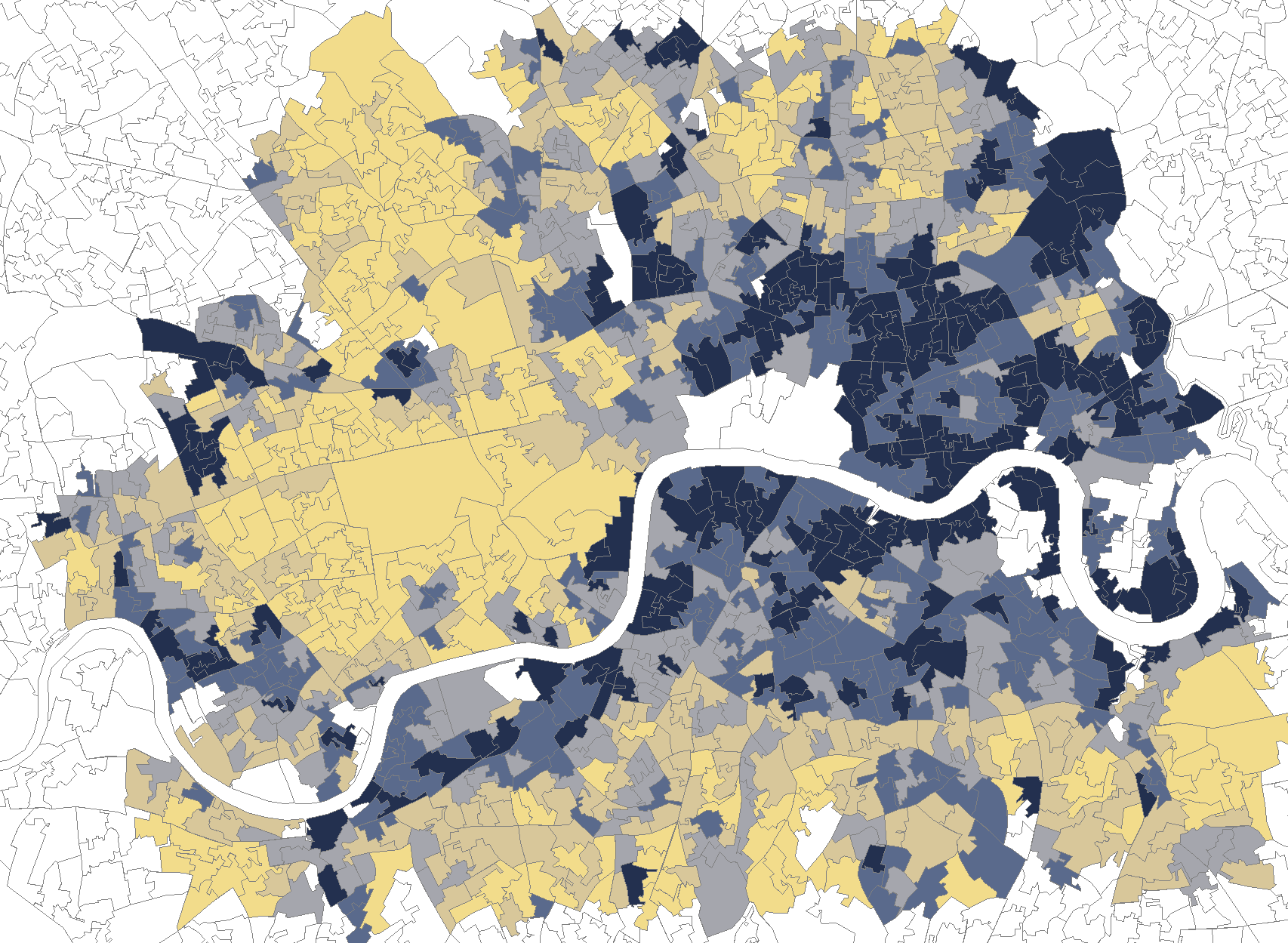
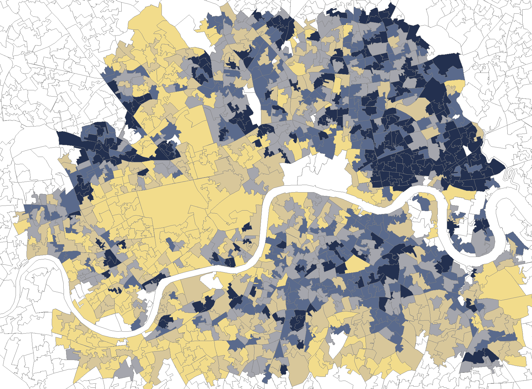
Outlined, without fill: areas not compared.
The exceptions run both ways. 17 areas from Booth’s poorest fifth are in England’s least income-deprived three-tenths (7 in Southwark, 4 in Wandsworth and 2 in Hammersmith and Fulham). 24 areas from his wealthiest fifth are in England’s most income-deprived fifth (7 in Hackney, 4 in Lambeth and 4 in Islington).
The two sides measure different things: printed colour by area in 1898–9, and people on low incomes in the 2025 indices, on today’s boundaries. The areas are today’s, so the comparison does not follow the same families. It is this page’s own calculation, not a published study.
How were the colours read from the map?
The scans
The twelve printed sheets come from LSE Library’s Charles Booth’s London, which publishes them with a public domain mark. Each sheet colours one district and prints its neighbours in grey, so the twelve were cut along the district edges and joined.
Placing them on today’s streets
Each sheet was fitted to today’s street network from OpenStreetMap by matching the pattern of streets. On street patterns held back from the fitting, the 1899 lines land a median 2.5 to 4.0 metres from today’s centrelines, depending on the sheet.
Telling the inks apart
The printers used solid ink for black, dark blue, purple, red and yellow, and line hatching in the same blue and red inks for light blue and pink. The reading uses the ink’s hue, its darkness and whether the print is solid or hatched.
Checking the reading
A second computer model was shown 360 magnified crops of the print, 40 to 60 for each colour and for uncoloured ground, each with one point marked, and named the colour at that point without seeing this page’s answer. Where it was sure (254 points) the two agreed on 92 per cent; over all 360 points, many of them on the edge of a block, on 84 per cent. Where the second model was sure, black was confirmed least often: 42 of 51 points, and most of the rest were dark blue with lettering or heavy hatching printed over it. Over all 360 points pink was confirmed least often: 22 of 40, and the second model was sure at only 13 of them. No person has checked the colours point by point.
What a street answer covers
A street’s colours are the printed area within 25 metres of today’s centreline. The lookup holds 17,983 named streets; 13,069 of them have Booth’s colour along them. Where a street was built or moved after 1899, the answer describes what stood on that line.
What carries no colour
The City of London, as it was bounded then, is uncoloured: it was left out of the street-level survey. Parks, docks, railways, factories and public buildings are uncoloured too, and so is everything outside the twelve sheets.
Sources
- Charles Booth’s London, LSE Library: the twelve sheets of the Map Descriptive of London Poverty, 1898–9. booth.lse.ac.uk
- LSE Library, “What were the poverty maps?” and the police notebooks. booth.lse.ac.uk
- Charles Booth, Life and Labour of the People in London, vol. 2 (1892), pp. 10 and 20–21 (“Statistics of Poverty”). archive.org
- Dorling, Mitchell, Shaw, Orford and Davey Smith, “The ghost of Christmas past: health effects of poverty in London in 1896 and 1991”, BMJ 2000;321:1547–51. doi.org
- Ministry of Housing, Communities and Local Government, English Indices of Deprivation 2025 (Open Government Licence v3.0). gov.uk
- Office for National Statistics, Lower layer Super Output Areas (December 2021) boundaries (Open Government Licence v3.0; contains OS data © Crown copyright and database right). geoportal.statistics.gov.uk
- Street lines and district names © OpenStreetMap contributors (Open Database Licence). openstreetmap.org