mariuscomper.ukRomână

Four London reds, 1852–1946

Why London’s post boxes and phone boxes are red

The post box was red, then green, then red again, and the phone box’s architect wanted it silver. Four London reds (post box, phone box, bus, Tube logo), year by year, with the written record of each change.

Four objects, year by year

Pillar boxGreen and red together, repainting
Phone boxNo standard kiosk yet
BusMany colours, one per route or operator
Tube logoNot invented yet
  • One colour
  • Many liveries
  • Varied or not on record
  • Mixed
  • Proposed

On file for 1874

June–October 1874

Red comes back, starting in London

A Post Office official records that he is in favour of a small trial of red boxes in London, and calls the green dingy. A month later the order is that London’s boxes be painted red. On 9 October the Controller extends it to all of them, as each comes due for repainting. The museum adds that people had complained of difficulty finding the green ones.

“very much in favour of the red pillars which he considers a great improvement upon the present dingy [green] colour”
“that the Pillar Letter boxes in London be painted red for the future instead of green as at present”
“please to have this done as repainting is required”
“Complaints were received by people having difficulty finding them”

Postal Museum, “Green Post Boxes” (Julian Stray, 2017) · Postal Museum, “The history of letter boxes”

Why did London’s post boxes go from green to red in 1874?

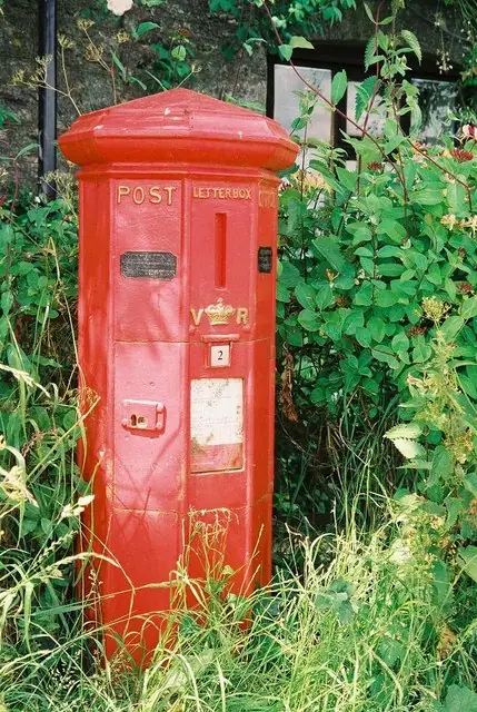
The first pillar boxes in the British Isles went into use in Jersey in November 1852, and a newspaper reported them painted red. The Postal Museum says Anthony Trollope, then a Post Office clerk and now better known as a novelist, proposed the boxes, probably after seeing roadside letter boxes in France and Belgium. Trollope himself wrote that he was the originator of the pillar box in England.

On the mainland, until 1859, local foundries made and painted the boxes, so they varied by region; a contract of 1857 asks for boxes bronzed, which the museum explains as green paint dusted with bronze powder. A standard design then arrived, and with it, the museum writes, a colour that appears also to have been generally standardised as green. Neither the museum nor its curator gives a reason for the choice. Julian Stray notes that bronze green was in vogue at the time, and reports only partial success in tracing a specification for the shade.

The museum calls the green boxes unobtrusive, excessively so, and says people complained of difficulty finding them. In June 1874 a Post Office official recorded that he was very much in favour of the red pillars, a small trial in London, as a great improvement upon the present dingy [green] colour. A month later the instruction was that London’s boxes be painted red for the future instead of green as at present. Repainting the rest took ten years.

Why is the red phone box red, when its designer wanted silver?

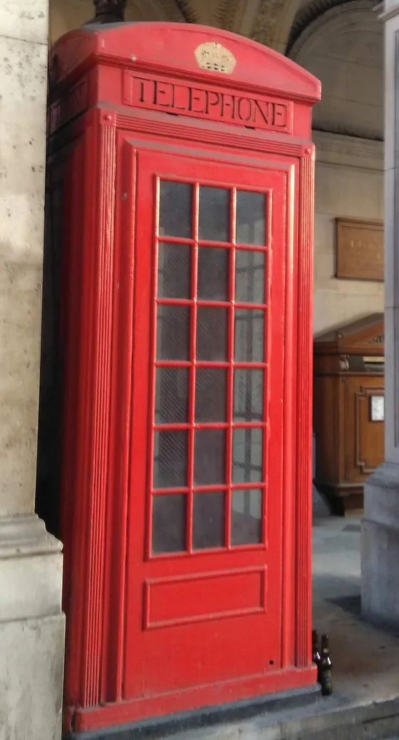
The Post Office’s first standard kiosk, the concrete K1 of 1921, had a red wooden door and was resisted by the London boroughs. In 1924 Giles Gilbert Scott entered a competition for a replacement, and in February 1925 the Royal Fine Art Commission judged his design the most suitable for busy streets in large towns. Historic England calls it reminiscent of the tomb that the architect Sir John Soane designed for his wife in St Pancras Gardens, in London.

Scott proposed steel painted silver outside, with a greenish-blue interior. The General Post Office, the British state post office, chose cast iron painted red instead. The first K2 stood in London in 1926 and about 1,700 went up within a decade, with only a small number outside London. The sources read here give no reason from the 1920s.

Scott accepted red, but did not like it everywhere. In May 1935, for the K6, a later model, he replaced his first idea of toned white with a warm, dove grey. On 19 August he wrote that he was more convinced than ever that bright red kiosks in an old village street or on a village green would be an abomination, while granting that red worked well in towns.

In 1936 the Post Office told local authorities why it wanted a single colour: it must be sufficiently conspicuous to be readily distinguished from its surroundings. The Royal Fine Art Commission, an official advisory body on design, had endorsed the Postmaster General’s view that Post Office red suited town and country alike, and the councils for the preservation of rural England and Wales concurred. BT Archives adds that the Council for the Preservation of Rural England later revised its position, and in 1946 a small number of dark battleship grey kiosks were allowed in places of special beauty.

Why are London’s buses and the Tube logo red?

From the 1840s the capital’s bus operators used colour schemes to tell routes apart, and Time Out quotes Caroline Warhurst of the London Transport Museum on the early motor buses: green, brown, yellow, maroon, and more. In 1905 the London Motor Omnibus Company, trading as Vanguard, painted its buses mostly red. In 1907 the largest operator, the London General Omnibus Company, still had no single colour. In 1908 it took over Vanguard, and the museum writes that red has been the colour of London buses ever since. The London Museum adds that the General and the other London bus companies eventually became part of London Transport, making red the city’s official, iconic colour.

Why red? Time Out reports that no document survives to say, and that Caroline Warhurst speculates the reason could be practical, since red paint tends to be more durable, or symbolic, since red has associations with strength and national pride.

The Underground’s symbol, the roundel, began in 1908 as a station nameboard with a solid red enamel disc and a blue bar, made so that station names stood out against the advertising. By 1917 the disc had become a ring. Transport for London now gives its corporate red as Pantone 485, in screen terms 225, 37, 27. All the reds in the drawings are that one modern screen red, not a reconstruction of any period paint.

Is there one reason London is red?

Each of the four has its own record. The post box was red in Jersey in 1852, green by 1859, and red again in London from 1874. A bus company chose red in 1905. The Underground’s nameboard had a red disc in 1908. The Post Office put the kiosk on the street in red in 1926, instead of its architect’s silver proposal. One of these overturned a colour in use, the green post box. One set aside a proposal, Scott’s silver. For the Tube logo, red is there from the first record; for the bus, in Vanguard’s mostly red livery of 1905. The sources read here give no reason for the colour in either case.

Where the Post Office put its reasons on record, they were about being seen or looking right: in 1874 its official called the green dingy, and the museum adds that people complained they could not find the boxes; in 1936 the kiosk had to be sufficiently conspicuous.

Where is the red not red?

Where can you stand next to them?

Three places have the real objects, with positions from Historic England’s own listing data. The first is in central London.

Or look at the next post box you pass. If its red paint is flaking, see what shows through: blue may mean it was once one of the airmail boxes of the 1930s.

The record in full

Every entry the dial plays, in order, with the words of the source in quotation marks.

  1. 23 November 1852

    The first pillar boxes open, in Jersey

    Four cast-iron pillar boxes go into use on the island of Jersey. The island’s newspaper, the Jersey Times, tells its readers they are “painted red”.

    “painted red”

    Postal Museum, “Green Post Boxes” (Julian Stray, 2017)

  2. 1853–1858

    On the mainland, local foundries make and paint them

    Boxes begin to appear in Great Britain proper, beyond the Channel Islands, in 1853. Until 1859 local foundries make and paint them, so the boxes vary from region to region. A contract of February 1857 asks for 100 boxes painted and “bronzed”, which the museum explains as green paint dusted with bronze powder. No single colour is established.

    “so they varied by region”
    “painted with four coats of paint, bronzed and delivered to any railway station”
    “green paint was applied and then dusted with bronze powder”

    Postal Museum, “Green Post Boxes” (Julian Stray, 2017) · Postal Museum, “The history of letter boxes”

  3. April 1855

    London’s first six pillar boxes open

    London’s first six boxes open in Fleet Street, the Strand, Pall Mall, Piccadilly and Rutland Gate: rectangular, cast in Hoxton, with pyramid roofs topped by an iron ball. The sources read here do not give their colour.

    “opened to the public in April 1855—the first letter boxes in London”

    Letter Box Study Group, “About boxes”

  4. 1859

    One design, and it seems one colour: green

    A standard box arrives and, the Postal Museum’s curator writes, a colour that appears to have been generally standardised as green, though perhaps with many exceptions. A Post Office paper of 1862 calls it “the Bronze Green Colour of the Boxes”. Neither the museum nor its curator gives a reason for the choice. Julian Stray notes that bronze green was in vogue at the time, and reports only partial success in finding a specification for the shade.

    “appears also to have been generally standardised as green”
    “in vogue”

    Postal Museum, “Green Post Boxes” (Julian Stray, 2017) · Jersey Heritage and Jersey Post, Historic Post Boxes in Jersey (2014)

  5. June–October 1874

    Red comes back, starting in London

    A Post Office official records that he is in favour of a small trial of red boxes in London, and calls the green dingy. A month later the order is that London’s boxes be painted red. On 9 October the Controller extends it to all of them, as each comes due for repainting. The museum adds that people had complained of difficulty finding the green ones.

    “very much in favour of the red pillars which he considers a great improvement upon the present dingy [green] colour”
    “that the Pillar Letter boxes in London be painted red for the future instead of green as at present”
    “please to have this done as repainting is required”
    “Complaints were received by people having difficulty finding them”

    Postal Museum, “Green Post Boxes” (Julian Stray, 2017) · Postal Museum, “The history of letter boxes”

  6. about 1884

    The repainting is done

    The Postal Museum says the repainting programme took ten years, which brings it to about 1884. Red stays the standard from then on, with few exceptions.

    “It took 10 years to complete the programme of re-painting”
    “Red remained the standard colour for boxes from then on with few exceptions”

    Postal Museum, “The history of letter boxes”

  7. 1905

    Vanguard paints its buses red

    From the 1840s London’s bus operators had used colour schemes to tell routes apart. In 1905 the London Motor Omnibus Company takes the fleet name Vanguard and paints its vehicles red, for the most part.

    “painted their vehicles predominantly red”
    “colour schemes called liveries to identify routes”

    London Transport Museum, “Why are London buses red?”

  8. 1907

    The biggest operator still has no single colour

    The London General Omnibus Company, the largest operator, adopts a winged-wheel symbol on its motor buses, and the name “General” soon follows.

    “without settling on a single livery”

    London Transport Museum, “Why are London buses red?”

  9. 1908

    The General takes over Vanguard, and red spreads

    When the General takes over Vanguard, its red colour, the General name and the wheel come together as one brand. Why red? Time Out reports that no document survives to say, and that Caroline Warhurst of the London Transport Museum speculates the reason could be practical, since red paint tends to be more durable, or symbolic.

    “Red has been the colour of London buses ever since”
    “there’s no surviving documentation as to why red was chosen”

    London Transport Museum, “Why are London buses red?” · Time Out London, “Most Googled: why are London buses red?”

  10. 1908

    The first roundel: a nameboard with a red disc

    The Underground’s symbol appears on station platforms as a nameboard, first at the station now called St James’s Park. It was made so that station names would stand out among the adverts.

    “a solid red enamel disc and horizontal blue bar”
    “to make station names stand out against the adverts and billboards on platform walls”

    London Transport Museum, “The Roundel” · Transport for London, “Our roundel”

  11. by 1917

    The disc becomes a ring

    The proportions are reworked, the solid disc turns into a circle, and the new symbol is registered as a trademark. London Transport Museum dates its spread to station exteriors to the early 1920s.

    “The solid red disc became a circle, and the new symbol was registered as a trademark”
    “from the early 1920s”

    London Transport Museum, “The Roundel”

  12. 1921

    The first standard kiosk is concrete, with a red door

    The Post Office introduces its first standard kiosk, the K1, in reinforced concrete with a red wooden door. Historic England says the London boroughs resisted it, and that dissatisfaction led to a competition in 1924, held by the newly established Royal Fine Art Commission at the request of the Postmaster General.

    “The Post Office introduced the first standardised design, the reinforced concrete K1 kiosk”
    “a concrete structure with a red wooden door which was resisted by the London boroughs”

    BT Archives, “Telephone kiosks” (2012), quoting Post Office files POST 33 · Historic England, list entry 1265820: prototype K2, Burlington House

  13. 10 October 1924

    Scott asks for silver, and a greenish blue inside

    Giles Gilbert Scott is in the competition for a standard kiosk. For the paint he suggests, in a Post Office file, silver outside and a greenish blue inside.

    “the outside of the kiosk should be treated with silver paint and the inside coloured a greenish-blue”

    BT Archives, “Telephone kiosks” (2012), quoting Post Office files POST 33 · GOV.UK, “UK's iconic first red public telephone box listed” (2019)

  14. February 1925

    Scott’s K2 is chosen, in cast iron and red

    The Royal Fine Art Commission judges Scott’s kiosk the most suitable for busy thoroughfares in large towns. When it is selected, the General Post Office chooses to make it in cast iron, painted red, not in Scott’s steel and silver.

    “most suitable for erection in busy thoroughfares of large towns”
    “the General Post Office chose to make it of cast-iron and painted red”

    GOV.UK, “UK's iconic first red public telephone box listed” (2019) · Historic England, list entry 1265820: prototype K2, Burlington House

  15. 1926

    The first cast-iron K2 goes up in London, painted red

    The first cast-iron K2 is installed in London, painted red. About 1,700 go up within ten years, nearly all in London. The sources read here give no reason from the 1920s. The London Museum says the Post Office chose its trademark red, which helped the kiosks stand out in the street.

    “The first K2 was installed in London in 1926”
    “the GPO chose its trademark red instead, helping them stand out on the street”

    Historic England, list entry 1265820: prototype K2, Burlington House · London Museum, “London’s iconic red telephone boxes”

  16. May and August 1935

    Scott on red kiosks in the countryside

    In May, for the K6, a later kiosk, Scott replaces his first idea of toned white with a warm dove grey. On 19 August he accepts that red works in towns, but writes that he is “more convinced than ever” that red will be an abomination in an old village street or on a village green.

    “a warm, dove grey”
    “more convinced than ever that bright red kiosks in an old village street or a village green will be an abomination”

    BT Archives, “Telephone kiosks” (2012), quoting Post Office files POST 33

  17. 1936

    The Post Office explains why one colour everywhere

    A leaflet to local authorities says the standard colour must be easy to tell from its surroundings, that the Royal Fine Art Commission has endorsed the Postmaster General’s conclusion that Post Office red suits town and country alike, and that the Councils for the Preservation of Rural England and Rural Wales concur.

    “sufficiently conspicuous to be readily distinguished from its surroundings”
    “has fully endorsed the conclusion of the Postmaster General”
    “full concurrence of this view has been expressed by the Councils for the Preservation of Rural England and Rural Wales”

    BT Archives, “Telephone kiosks” (2012), quoting Post Office files POST 33

  18. 1946

    Grey is allowed in places of special beauty

    BT Archives says the Council for the Preservation of Rural England later revised its position and petitioned for a colour change in sensitive areas. In 1946 a small number of kiosks may be painted dark battleship grey in areas of special beauty. The glazing bars stay red.

    “later revised their position”
    “allowing a small number of kiosk to be painted Dark Battleship Grey in areas of special beauty”

    BT Archives, “Telephone kiosks” (2012), quoting Post Office files POST 33
Sources and method

The record comes from the Postal Museum (its curator’s 2017 blog and its letter-box history), the Jersey Post and Jersey Heritage report on historic boxes, the Letter Box Study Group, Royal Mail and Historic England’s joint statement, Historic England’s listings, BT Archives’ transcription of Post Office files, the London Museum, London Transport Museum, Time Out and Transport for London. Words in quotation marks are the source’s own wording.

The greens, greys and other non-red colours in the drawings are approximations of a named colour; the reds are all one modern screen red. No paint sample or specification from the period is cited in these sources, and the Postal Museum’s curator reports only partial success in finding one. The modern specifications are Royal Mail’s post box red, BS 381C colour 538 (in the joint statement of Royal Mail and Historic England), and Transport for London’s corporate red, Pantone 485. Hatching marks a colour that varied or that the sources do not give. Each drawing shows the standard colour or design the sources give for that object. Other examples stood beside them: concrete K1 and cream K3 kiosks, grey kiosks after 1946, other operators’ buses. The shapes are generic drawings: a pillar box, a K2 kiosk, a motor bus, the roundel as a design (London Transport Museum dates its spread to station exteriors to the early 1920s).

Where sources disagree: Time Out dates the General’s takeover of Vanguard to 1907 and London Transport Museum to 1908, and the page follows the museum. Historic England dates the K6 design to 1935 and BT Archives its launch to 1936. BT Archives also records an earlier open Post Office competition, in 1923, that produced no suitable design. The year 1884 is 1874 plus the ten years the Postal Museum reports; no source counts boxes year by year.

Positions: Historic England listing points, read from planning.data.gov.uk.

More about London